

British Elite Athletes Association redesign and build
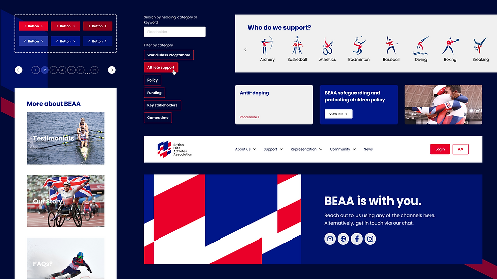
A full website redesign and build for the British Elite Athletes Association, bringing together branding, UX/UI and development to create a clearer, more accessible and modern digital presence.
I worked closely with the client throughout the project to understand organisational goals, audience needs and content priorities. My involvement covered user journeys, content mapping, site structure planning, interface design in Figma and full Webflow development.
Deliverables
Website Development
User Experience
User Interface
View live site:
I worked closely with the client throughout the project to understand organisational goals, audience needs and content priorities. My involvement covered user journeys, content mapping, site structure planning, interface design in Figma and full Webflow development.
Deliverables
Website Development
User Experience
User Interface
View live site:
The rebrand had all the sentiment and anticipation of a big-reveal makeover or grand unveiling – but customers needed to know this was the same spa they knew and loved. We captured Ragdale’s confidence, heritage and prestige with a clean, contemporary look still rooted in their historic past, so customers could feel excited, yet at ease with the changes.
The rebrand had all the sentiment and anticipation of a big-reveal makeover or grand unveiling – but customers needed to know this was the same spa they knew and loved. We captured Ragdale’s confidence, heritage and prestige with a clean, contemporary look still rooted in their historic past, so customers could feel excited, yet at ease with the changes.
The challenge
The BEAA supports a wide range of elite athletes, meaning the website needed to communicate multiple services, support pathways and resources clearly across different audiences.
The existing experience lacked cohesion and made it difficult for users to navigate key information quickly. The challenge was creating a structure that felt intuitive and accessible while still carrying the organisation’s identity and professionalism.


Approach
The project started with understanding how users would move through the site and where friction points existed. I mapped out content structures and user journeys before moving into interface concepts and visual direction.
The design approach focused on clarity, hierarchy and accessibility while modernising the overall experience. Strong use of layout, spacing and navigation helped simplify large amounts of information without making the site feel stripped back or clinical.
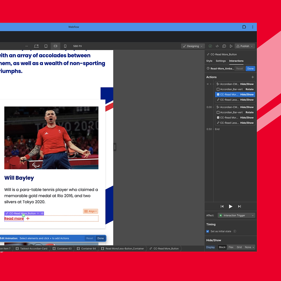
Alongside the design work, I developed the site in Webflow, translating the concepts into a responsive and scalable build. My understanding of the front end experience and my improving understanding of the back end, whilst working alongside developers helped bridge the gap between design intent and technical implementation throughout the project.



Outcome
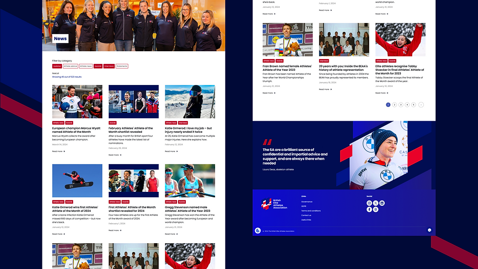
The final website delivered a cohesive and user friendly experience, improving navigation, content clarity and overall usability while giving the organisation a stronger and more contemporary digital presence.
Want to see more?

Risk Response Unit
Learning design & development