


Aspire to HE redesign
A website refresh and digital concept project for Aspire to HE, focused on creating a stronger visual identity, clearer user journeys and a more engaging experience aligned to the organisation’s existing brand.
I worked closely with the client throughout the project to understand organisational goals, audience needs and content priorities. My involvement covered user journeys, content mapping, site structure planning, interface design in Figma and full Webflow development.
Deliverables
Website Development
User Experience
User Interface
Concept Development
Deliverables
User Experience
User Interface
User Interface
Website Refresh
Concept Development
User Experience
Website Refresh

This project explored how to present Harlaxton Manor as a study destination, an event space and public-facing estate. Set within a historic manor and gardens, the site needed to balance academic credibility with a sense of place and experience.
Harlaxton serves multiple audiences, from prospective students to visitors booking tickets, which creates competing user needs. The challenge was to bring these journeys together without making the site feel fragmented or overly complex.
There was also a need to respect the heritage and visual identity of the estate while modernising the experience, ensuring it felt current without losing its sense of place.
The challenge
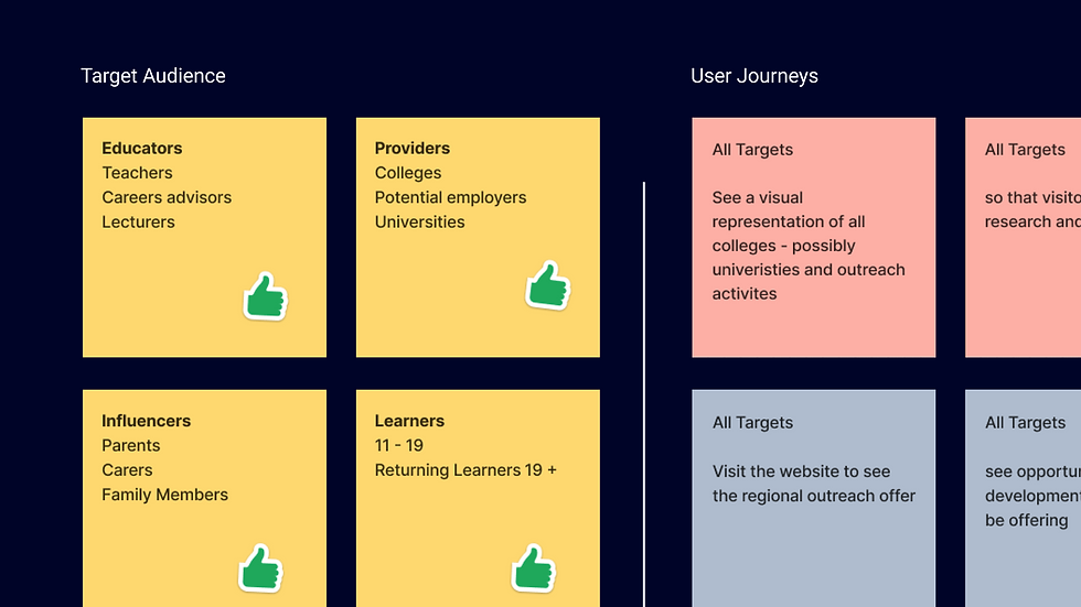
The existing site required a clearer and more cohesive digital direction that better reflected the Aspire to HE brand and the audiences it supports.
The platform serves multiple user groups including students, educators and partner organisations, meaning the experience needed to balance information, accessibility and engagement across different journeys and content needs.


Approach
The project began with collaborative workshops focused on understanding the wider goals of the refresh, user needs and the reasoning behind key project decisions. These sessions helped shape the structure of the experience, define user journeys and identify both functional and visual priorities early in the process.
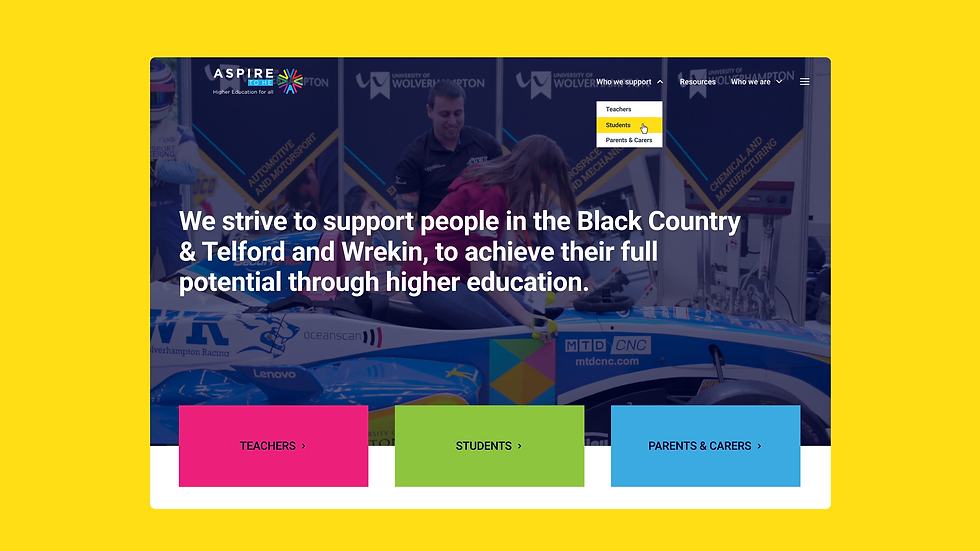
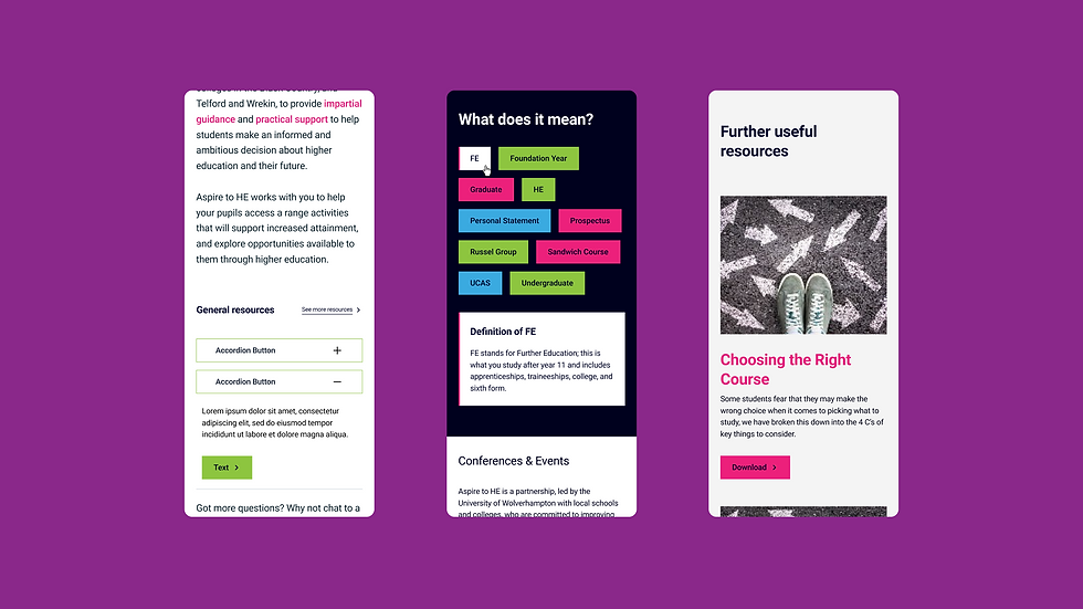
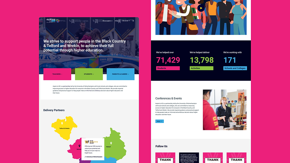
A key focus was creating a refreshed look and feel that felt recognisably tied to the existing Aspire to HE brand while modernising the overall digital experience. Bright colours, bold layouts and modular content structures were introduced to create a more engaging and flexible visual system across the site.
Alongside the visual design work, I developed user journey mapping, wireframes and interface concepts to explore how different audiences would navigate and interact with the platform. Particular attention was placed on hierarchy, accessibility and creating clearer pathways to key information.
The process remained highly collaborative throughout. I worked closely with the client and regularly met in person with the Aspire to HE delivery team to present progress, gather feedback and refine the direction collaboratively as the project evolved.
Outcome
The final concept delivered a more vibrant and cohesive digital direction that strengthened the Aspire to HE brand while improving clarity, usability and overall user experience.
The project demonstrated the value of combining collaborative discovery, UX thinking and strong visual design to create solutions that feel both strategically grounded and visually engaging.
Want to see more?

Risk Response Unit
Learning design & development
